SELECTED WORK
BRANDINg
Bread & Spread
The Bread & Spread sandwich shop started out of 300 sq. ft. in the lobby of a Dumbo building. The design strategy was industrial + rustic to match the feel of the location and it included an iconic symbol, affectionally nicknamed “Toastie”.
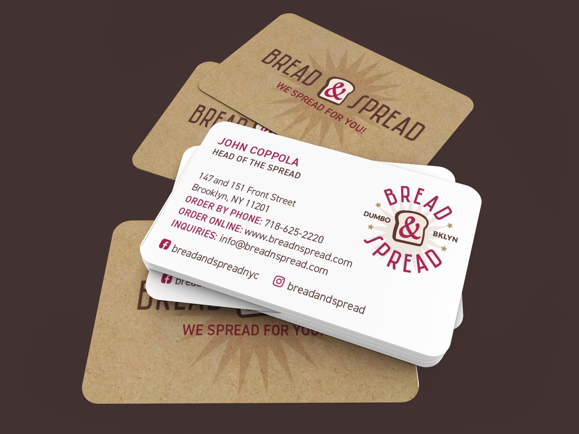

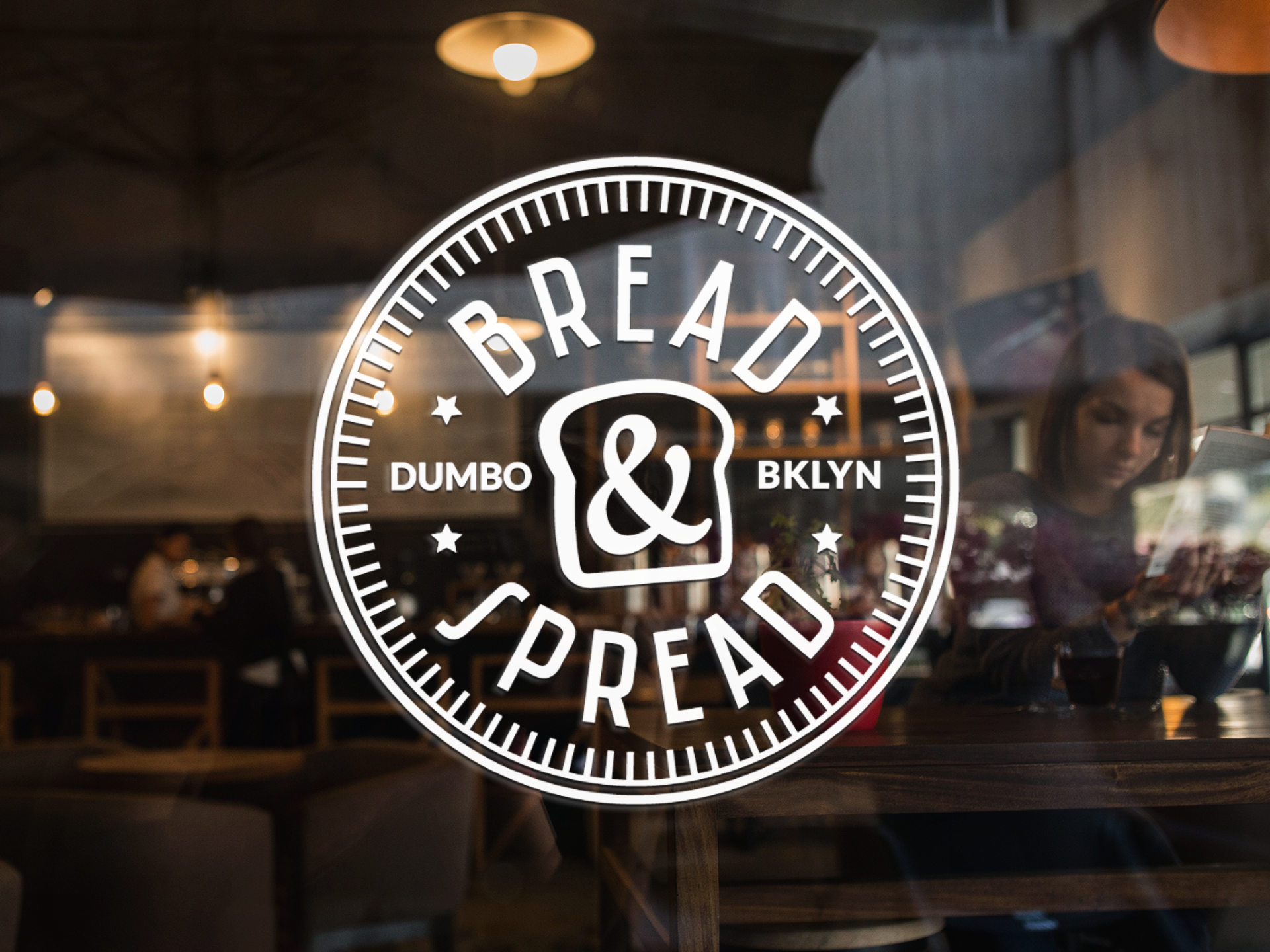


“The Bread & Spread branding and symbol has become recognizable by Brooklynites and has given my café a unique vibe. I liked that the different versions of the logo could easily be adapted into items like stickers and the toast ampersand symbol is creative but functional.”
— JOHN COPPOLA, OWNER
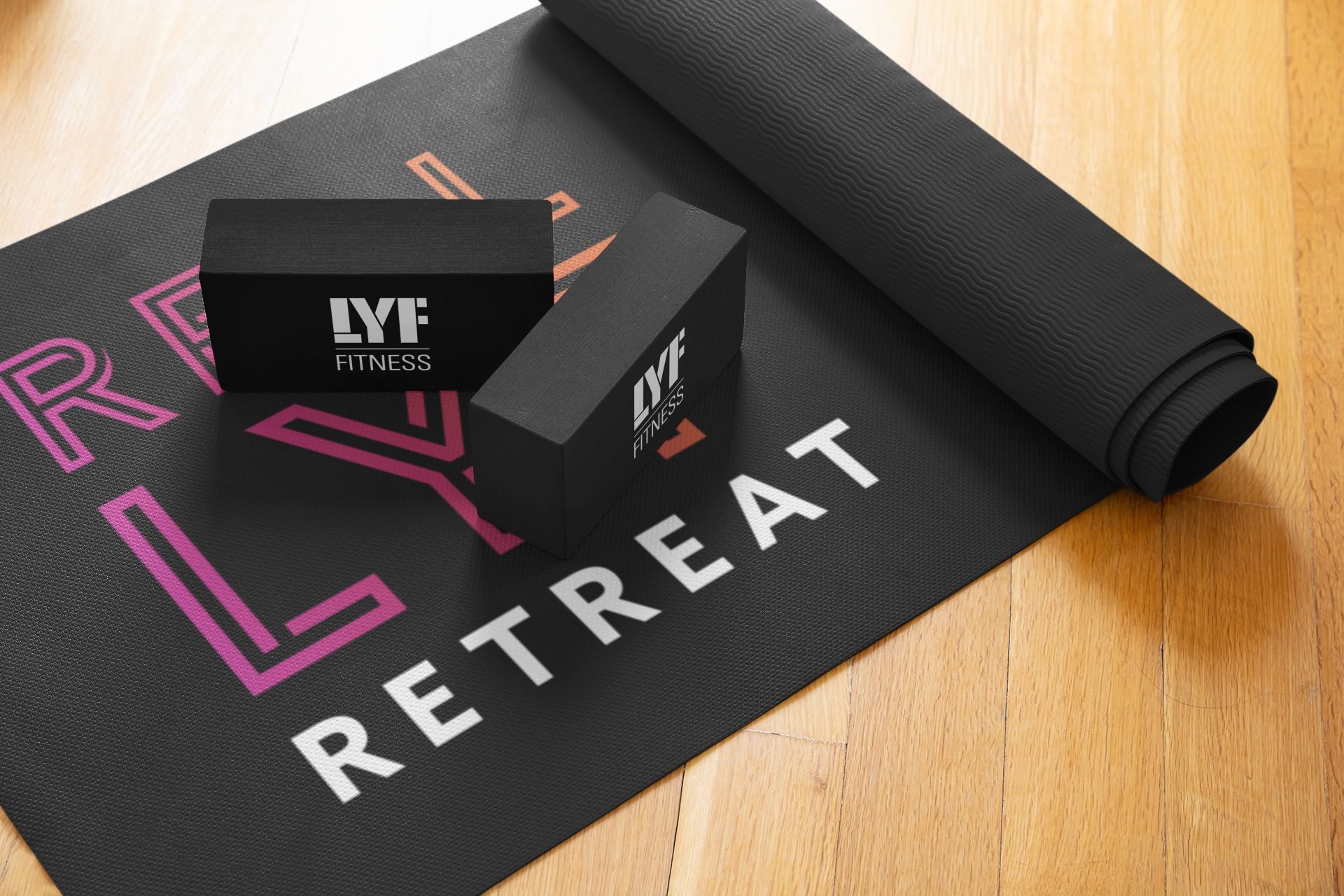
real lyf retreat
Real LYF Retreat was a new business venture from LYF Fitness. A three to five day wellness experience combining outdoor and indoor work-outs, Pilates, eating well, reiki and meditation. The brand strategy focused on expressing movement and strong feminine energy.


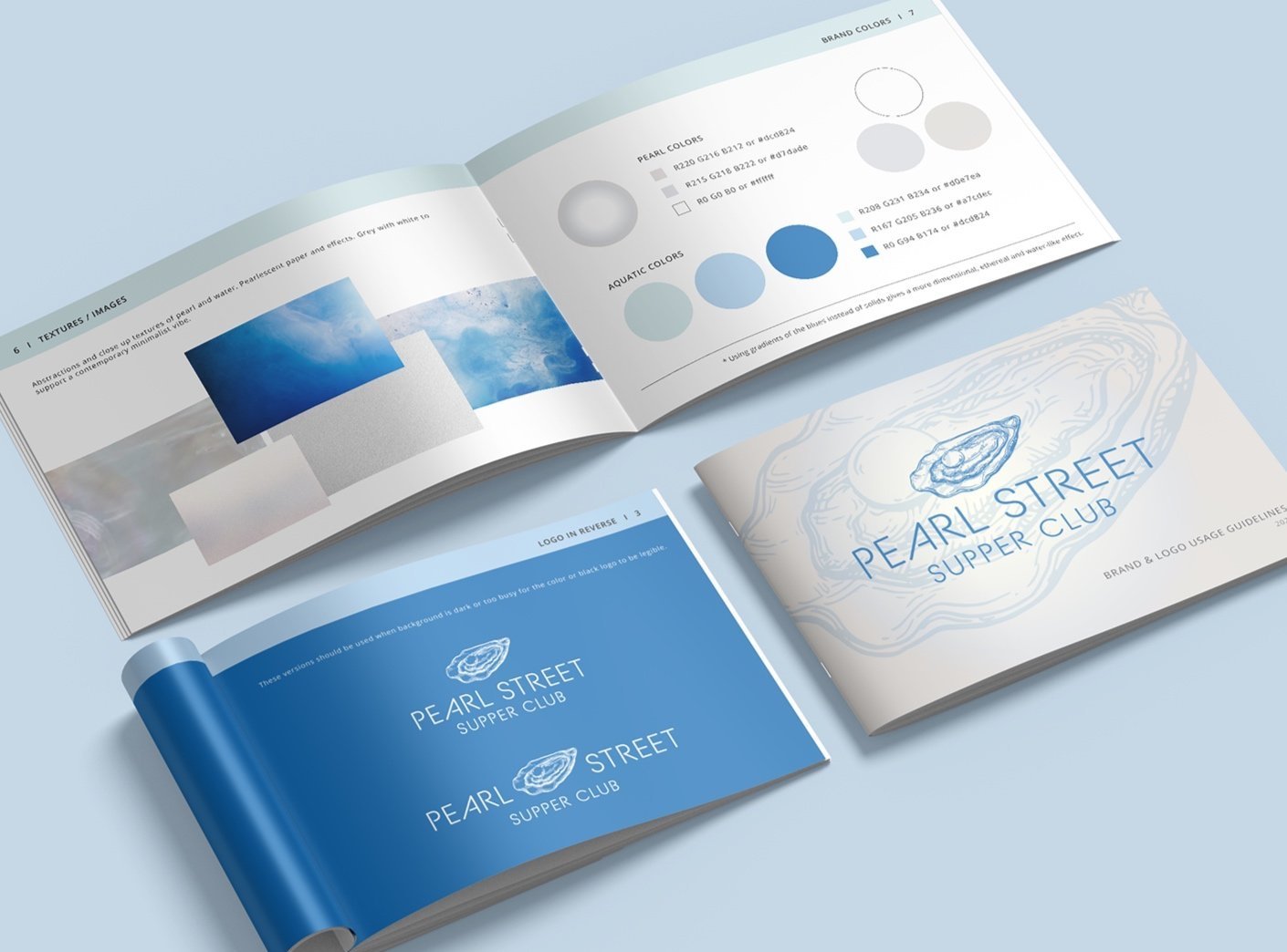
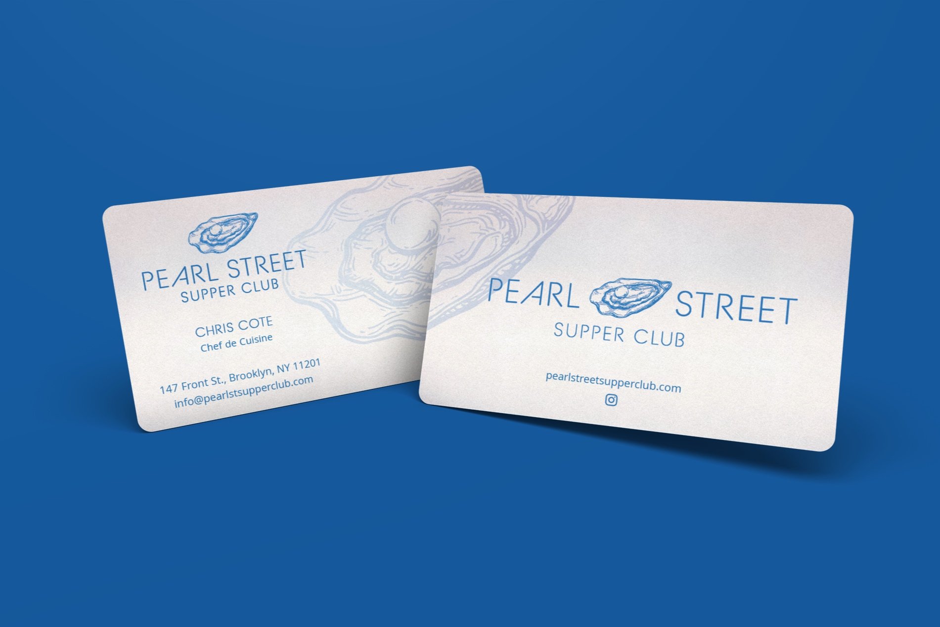
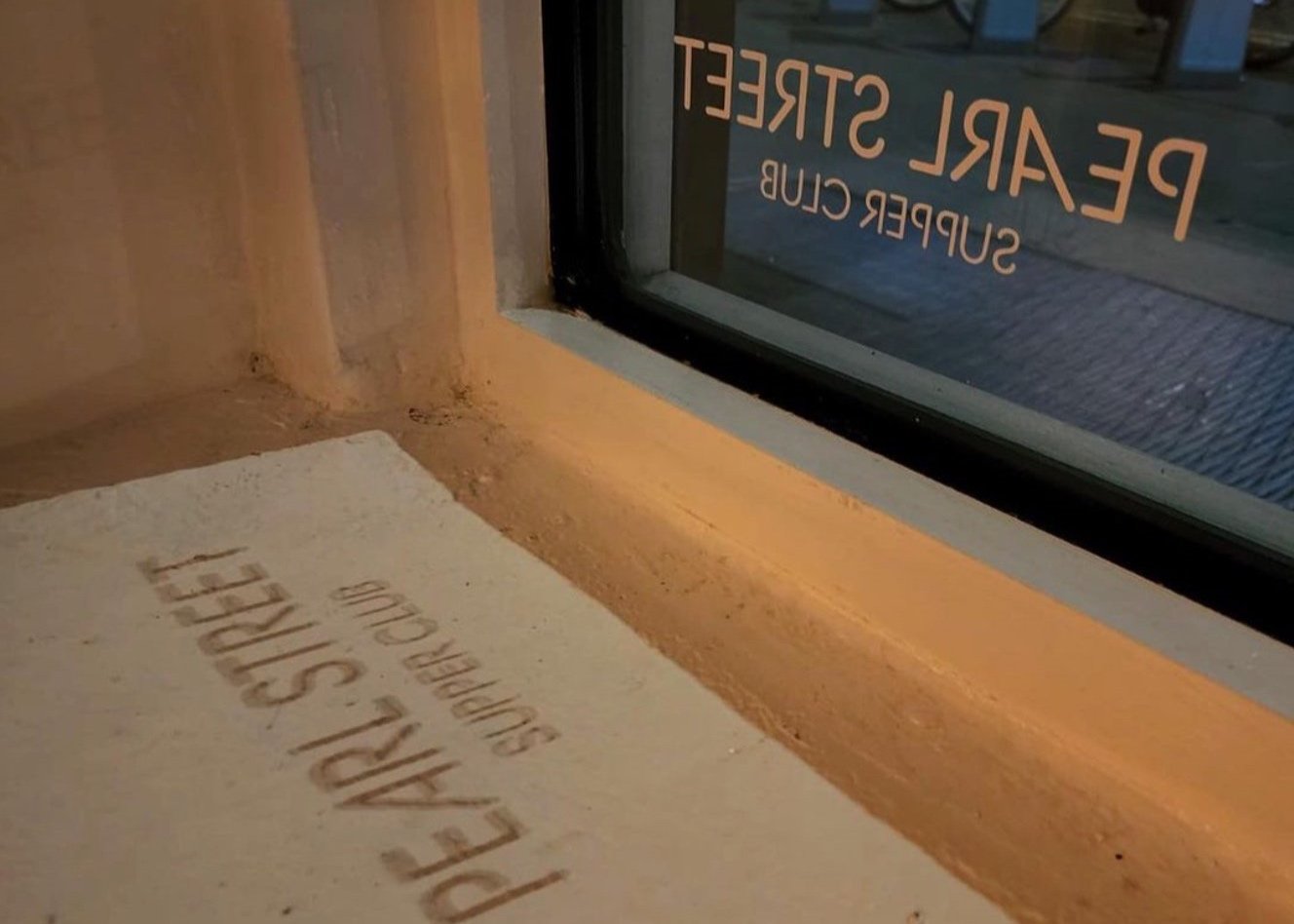
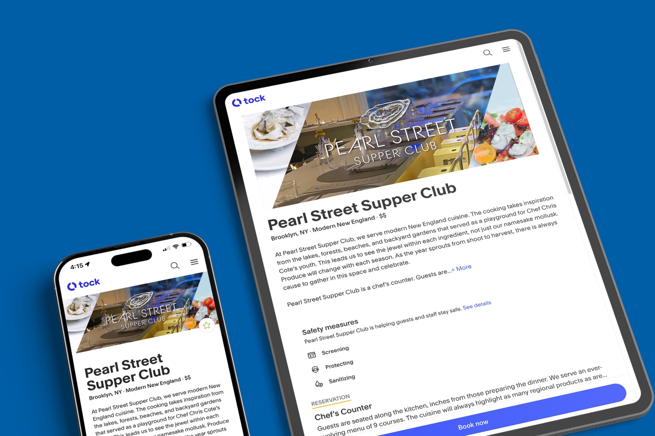
pearl street supper club
The journey to develop PSSC’s visual identity was a longer process with designs ranging as we explored what kind of image we wanted the new establishment to have. Finally landing on a combination of a traditional illustrative symbol but a contemporary minimalist decor and supporting visuals such as the font and graphics.


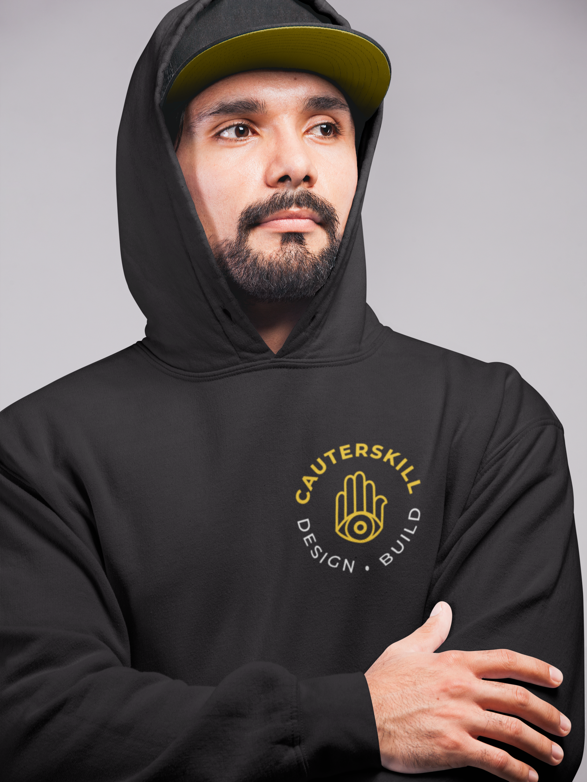
cauterskill design & build
I was fortunate to bring a client’s idea to life and design a brand kit for them to use on their apparel, vehicles and stationery. The hand symbol and yellow accent color make a bold & memorable statement to distinguishes this building company from the competition.